Distracting the user from completing their goal
Is the website making it harder for the user to find out the information they are after? This is known as information architecture – making sure that the information is not cluttered and categorised in a logical way that it is easy for the user to find what they need. Can the customer find your pricing & support pages and find the information they want or is it hidden away in the footer’s navigation instead of the main one?
No one wants to be wasting time jumping through the mega-menu to find the page they’re after. Distracting users goes beyond content & is interchangeable with some UI issues, such as animations that take a long time to execute or transitions… or even worse, music that automatically plays.
Not making things clear
How long does it take for someone to know what a page is? A good rule of thumb is that users should not be required to think about what a certain page is & should instinctively know without much thought. For example, you may have a product page called ‘Services’ which is direct. On the other hand, ‘Capabilities’ may be vague.
This also goes for other elements of the website other than the navigation; such as making sure the copy is clear. Generally, people don’t read every bit of content on a page. Thus, it’s important that content is divided into bite-size headings and subheadings, which makes it easy to quickly scan through the site to find what they are after. Also, when you are on mobile, you don’t want to see huge paragraphs.
Likewise, call-to-actions also need to work in a logical way. If I click a call-to-action to sign-up for a free trial it takes me to a booking page with a sales rep. Again, this does go hand in hand with UI design, making sure a button looks like a button and also making sure it guides the user to meet their goal. You see this a lot with SaaS products when you go to deactivate or close your subscription – the go back button is always highlighted with the cancel subscription button greyed out or a grey hyperlink.
Sloooooow website
Slow websites are incredibly frustrating. It’s like when you are walking behind slow people when you’re in a rush to do something… Much like how I do not have patience for being behind people walking at a snail’s pace – people do not have the patience to wait for a page to load.
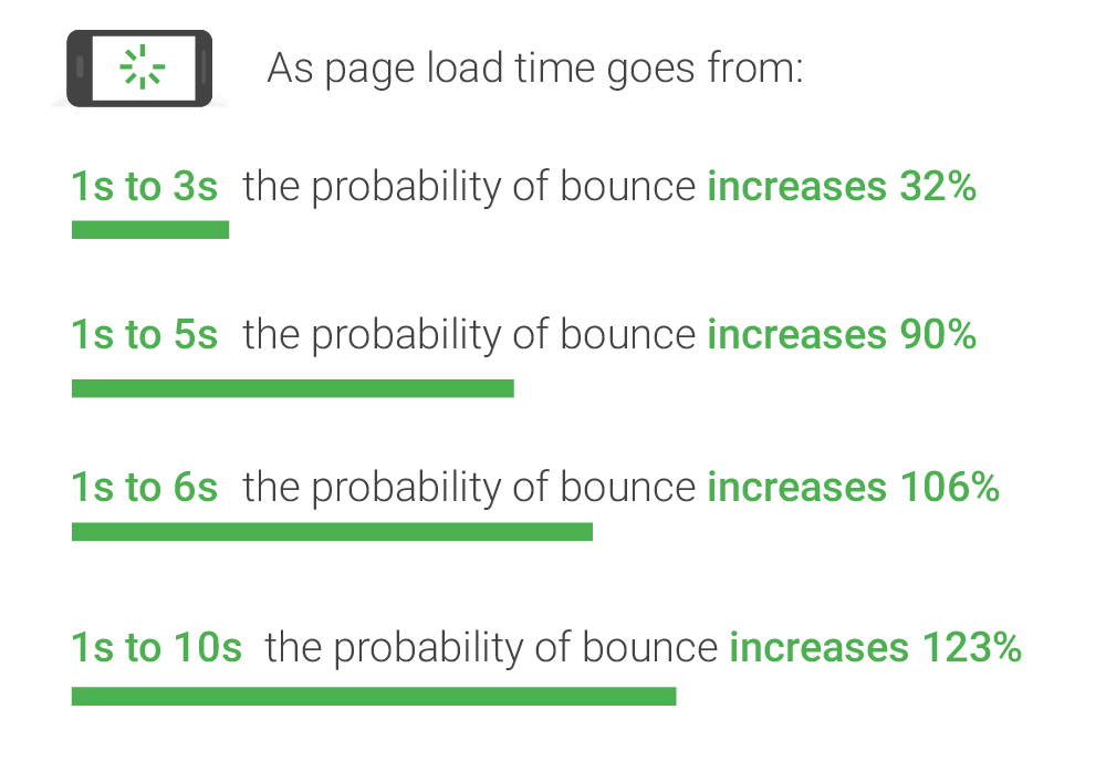
Credit to Think with Google for the above image on how page speed affects mobile bounce rate.
The page should be optimised to load in under 3 seconds. According to Google, as page load time goes from 1s to 3s this increases the bounce rate by 32% – so not only does a fast website help get more users to stick on the site, it also helps with SEO too which is nice. Every site we build has a CDN (content delivery network), minified JS & CSS, and automatically optimised image sizes as these all improve page loading times. If you’re building your own site, it’s worth checking these are implemented to maximise page speed.
In short, it’s important to make sure that your website (both UI & UX) helps facilitate the user’s needs, and not hinder them. This is especially important if you’re spending money on marketing efforts to get traffic to the site; for a significant amount of users to bounce.